Build: one session (12 June 2026), ~45 minutes wall-clock ·
tokens (estimated): ≈1.5M in (mostly cached context re-reads, plus rendering
and visually inspecting every chart iteration) / ≈45k out (data tables, code, page,
narrative) · model: Claude Fable 5.
Figures are estimates from the session log, not billing telemetry.
The previous post
refused to compare across epochs: it measured land for everyone, switched honestly to
GDP for the moderns, and left the two charts un-exchangeable. This post attempts the
exchange rate. The result is not one true number — it is four defensible numbers, an
ensemble that averages them, and an instrument panel that lets you disagree with me.
I.One yardstick that survives 2,500 years
Every absolute measure of power dies outside its own era. Square kilometres flatter
the Mongols with empty steppe and call 1942 Japan a great power while B-29s were being
drawn. GDP barely means anything before 1500, when nearly everyone farmed at
subsistence. Armies inflate with population; navies exist only after ships matter.
The one trick that survives is to stop measuring things and start
measuring shares: power is relational, so express every candidate metric as a
fraction of the contemporaneous world — Rome against the world of 117 CE,
America against the world of 2026.
Four lenses, each a share of its own world:
p — people ruled
Share of world population under direct rule. The agrarian logic: people were
taxes, grain, and levies.
y — output
Share of world gross product, at purchasing-power parity — the same share
defined in eq. (1.3) of post one.
The industrial logic.
m — force
Share of world military capacity: manpower for most of history, blending toward
share of world military spending in the 20th century (your “normlaisation between
population and military/navy sizes”).
n — network
Share of world population inside the empire’s wider sphere: vassals,
tributaries, formal allies, and the monetary and linguistic orbit. The soft-power
lens — and the softest numbers on this page.
How to read the indices, since this symbol carries three of them:
the subscript e names whose share (the empire), the superscript
(k) in parentheses names which lens — it is a label, not a power —
and t is the calendar year. So
reads “America’s share of world military capacity in 2026.”
is the lens’s raw quantity — people, output, soldiers-or-spending, sphere
population — and dividing by the world total is what turns it into a share. When a
superscript is a true exponent, it will sit bare, without parentheses, like
the weights in (2.3) below.
One closure assumption stitches the epochs together. Before roughly 1500, per-capita
output everywhere sat near subsistence, so an empire’s share of output was its share
of mouths:
That is not a convenience; it is the deep reason your first post’s land-vs-GDP
tension exists at all. The lenses used to coincide. Land grew people, people
were output, output paid soldiers. Modernity is precisely the era in which the four
lenses tore apart — and the size of the tear is measurable.
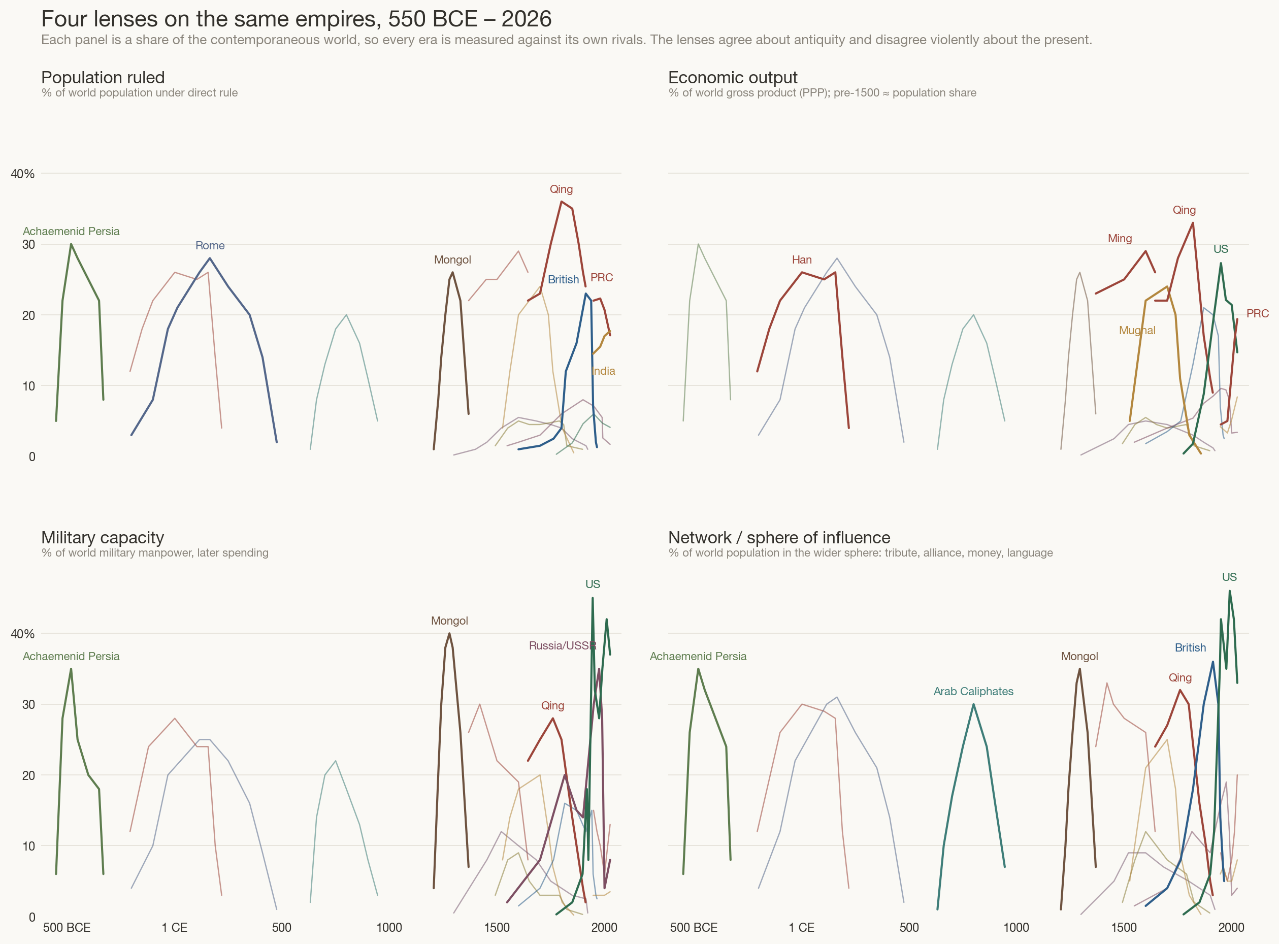
II.Four lenses on the same empires
Here are fifteen of the largest polities of the last twenty-five centuries — the
same cast as the cascade, thinned to those with defensible numbers — drawn under
each lens in turn. As with every chart on this site, all four panels share one
scale.
Figure 1. The same empires under four lenses, each a percent of the
contemporaneous world. Top left: people under direct rule. Top right: gross product
(PPP), equal to population share before ~1500. Bottom left: military capacity.
Bottom right: population inside the wider sphere of influence. Estimates after
McEvedy & Jones, the Maddison Project, P. Kennedy, the Correlates of War
project, SIPRI, and IMF; precision is one significant figure at best.
Read the panels left to right and the modern revolution announces itself. In
antiquity the panels agree: Achaemenid Persia, Rome, Han China are
great in every lens at once, because the lenses were the same thing wearing four
hats. From 1800 they tear apart. The Qing hold a third of humanity while their
military share collapses toward zero — the lenses’ first great divorce, and China’s
“century of humiliation” in four lines. Britain rules 23% of people and 20% of
output but never more than ~15% of arms; its true monopoly is the bottom-right
panel — sterling, cables, coal stations, English — where it peaks near
36%. The United States inverts the ancient pattern entirely: 4% of people,
a third or more of force and influence. And the Mongols, modest in population,
are the all-time military outlier — 40% of world fighting capacity in the saddle.
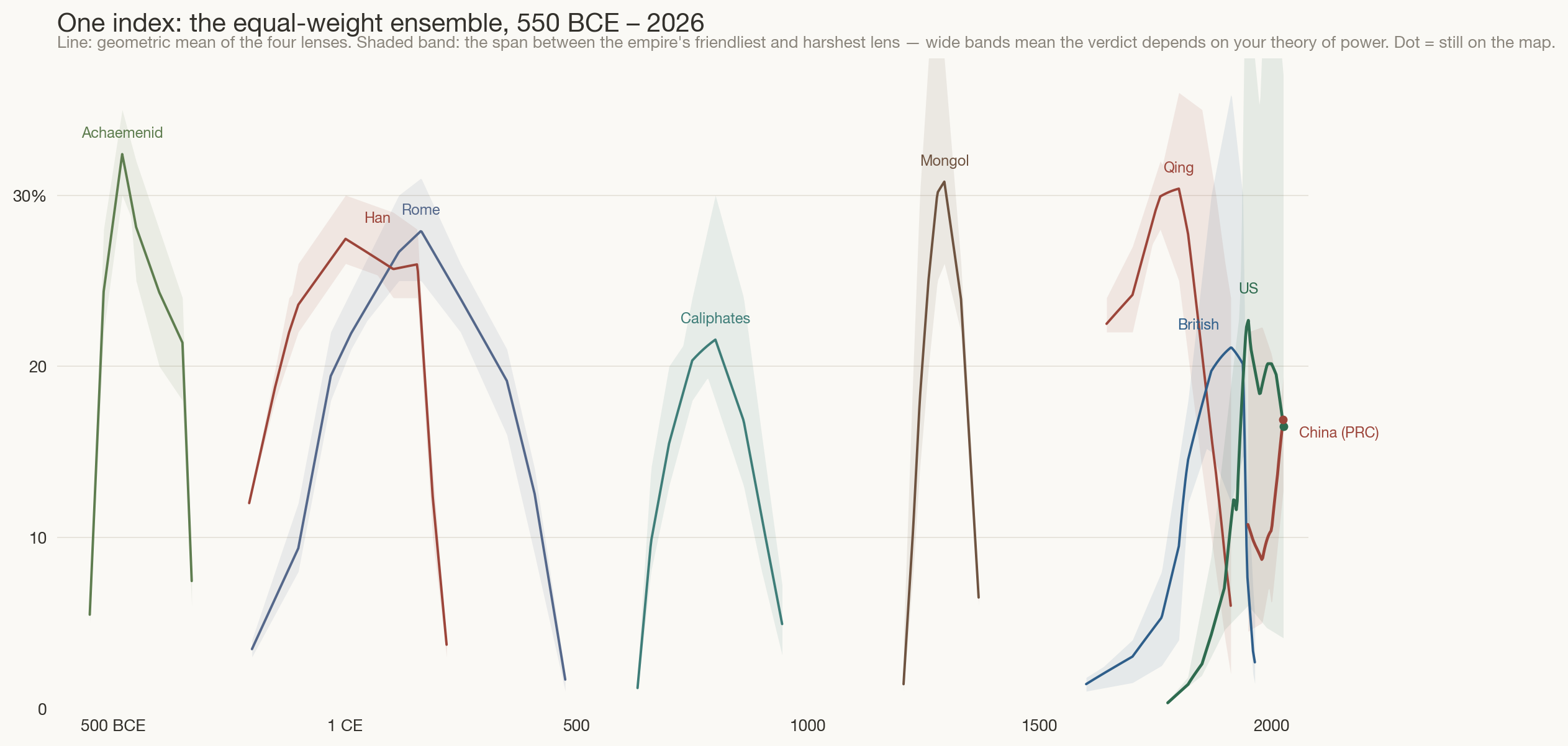
III.The ensemble — and its error bars
To consolidate the lenses, combine them multiplicatively. With weights
summing to
one2,
The geometric mean is the right consolidator for exactly your reason — empires
faced “different conditions/tech/population/incetnives.” It is unit-free, it cannot
be gamed by one freakish lens (an arithmetic mean would let the Mongols’ 40% of
soldiers paper over their 2% of looms), and it rewards balanced power, which
is what made empires durable. Alongside the line we plot the honest part: the span
between each empire’s friendliest and harshest
lens3,
a model-disagreement band: where it is narrow, any theory of power gives the same
verdict; where it is wide, “who is winning” depends on what you believe power is.
Figure 2. The equal-weight ensemble for nine majors. Bands span the
four lenses’ disagreement. Antiquity’s bands hug their lines; the modern bands yawn.
The United States and China end 2026 within half a point of each other —
a statistical tie far inside both bands.
Two readings. First, the all-time league table is not what a Western syllabus
suggests: on this index the peak performers of history are Achaemenid
Persia, Rome, Han, and Qing China — the demographic giants — with the Mongols
spiking among them; the British Empire at 1913 reaches the same ~22% tier, and the
United States has never exceeded ~24% even in 1950. Second, look at the bands.
Before 1500 they are slivers — any model agrees Rome was Rome. After 1800 they are
chasms. The modern era is not harder to measure because the data is
worse; it is harder because power itself decomposed.
IV.Build your own theory of power
Equal weights are my prior, not a law of nature. You suggested combining
“ALL of those models” — here is the combination, with the weights handed over to
you. Drag the sliders (or take a preset) and the whole of history recomputes under
your theory of power: believe only in heads, and the chart is forever Asian;
believe only in force, and the twentieth century is a Soviet–American wall;
believe in networks — your “soft power type thing” — and Britain and America
take turns owning the modern world.
Hover a curve to isolate one empire
The 2026 ranking under your weights
Figure 3 (interactive). Every empire’s index
under your chosen weights, recomputed live from the same data as Figures 1–2
(power_data.js). Weights are renormalised to sum to 1.
No JavaScript beyond this page; nothing leaves your browser.
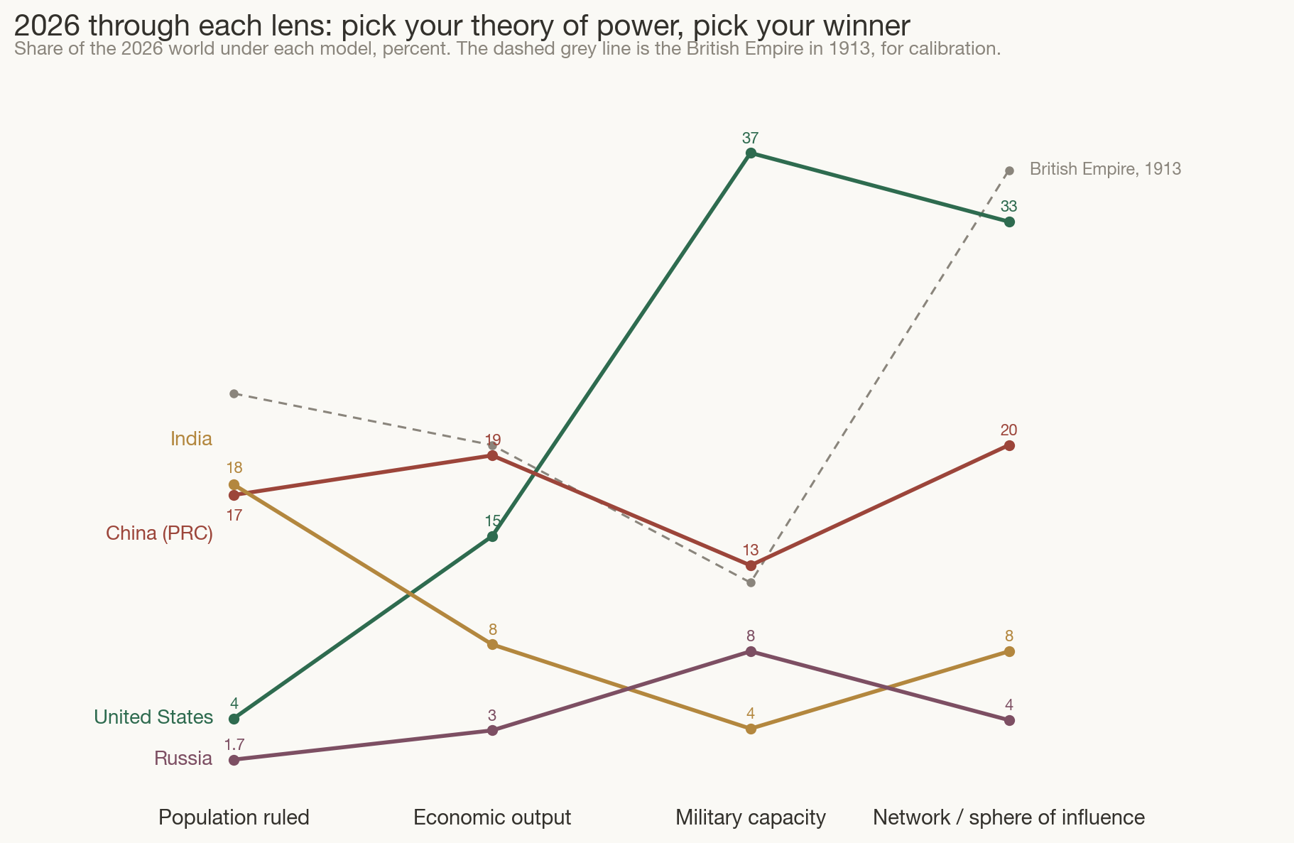
V.2026 through each lens
Finally, hold today still and walk the lenses across it.
Figure 4. The 2026 powers under each lens, percent of the world.
Dashed grey: the British Empire in 1913, the last time one polity led the network
lens by this margin. Lines cross — which is the point.
The chart is a machine for generating arguments, which is what it should be.
India wins the people lens and nothing else — yet it is the only major power rising
in all four. China wins output and is second everywhere else. The United States is
nearly invisible in the people lens and dominant in force and network — the most
lopsided great power in recorded history. And your closing
intuition — “maybe soft power even more so” — has a precedent on this very chart:
Britain in 1913 also led the world chiefly through its network (36%, against 12% of
arms), and that network empire unwound in forty years once the underlying lenses
(output, force) had already moved elsewhere. Networks amplify power; the 1913 ghost
is a caution about what happens when they are all that is left.
VI.Claims, carefully labelled as claims
The figures are estimates (see Method); what follows is interpretation.
There is no honest single number — and that is a finding, not a failure.
The defensible consolidation is an ensemble plus a disagreement band. Antiquity’s
bands are slivers; 2026’s are the widest in recorded history. Asking “who is the
most powerful country” today is like asking for the temperature of a thing that is
boiling in one place and freezing in another.
Pick your lens, pick your winner. Any weighting that prizes people or
output hands this century to Asia; any weighting that prizes force or networks keeps
it American. On equal weights, the US and China end 2026 in a statistical tie
(~17% each) — which is precisely why the present feels contested from inside.
America is the most lopsided great power ever measured. Four percent of
humanity holding roughly a third of force and influence. Every previous empire in
this set was broad-based at its peak. Lopsidedness has historically resolved in one
of two ways: the strong lenses erode toward the weak ones (Britain after 1913), or
the weak ones are simply never needed (no precedent). The American experiment is
whether the second path exists.
Soft power is the modern land. The network lens is the only one in which
a modern power matches antiquity’s giants. Britain invented that trade — peaking at
36% of the world in its orbit with barely a tenth of its arms — and America
industrialised it (Bretton Woods, the dollar, alliances, English, the internet
platforms). China is now building the first serious rival network since 1945. If
the 21st century has a Figure 1, it will be drawn in this lens.
India is the quiet ascendant. It leads no lens but rises in all four —
the only major power for which that is true. On the agrarian logic that governed
twenty of the last twenty-five centuries, the largest pool of people eventually
prices in.
VII.Method & honest caveats
Every series is hand-tabulated waypoints, linearly interpolated exactly
as in eq. (1.2) of
post one, and floored at 0.05% before the
geometric mean so a single sparse lens cannot zero an empire out. Data quality is
tiered: population shares are the firmest (McEvedy & Jones; Maddison), output
shares are heroic before 1820 (Maddison Project, PPP; IMF after 1980), military
shares are rough everywhere (manpower after P. Kennedy and the Correlates-of-War
tradition, blended toward SIPRI spending shares in the 20th century — manpower and
spending genuinely disagree, e.g. China today), and network shares are estimates to
one significant figure that reasonable people will dispute by half. Dispute them:
the sliders exist so my judgment is an input, not a conclusion.
Prior art, so this page doesn’t pretend novelty: the Correlates of War
CINC index (six shares, arithmetic mean, 1816 onward), Paul Kennedy’s
Rise and Fall of the Great Powers (the economics–military tension), Ian
Morris’s social-development index (energy capture, four traits, 14,000 BCE onward),
and Joseph Nye’s soft power (the n lens, named). This page’s contribution is modest:
shares-of-the-contemporaneous-world as the exchange rate, a geometric rather than
arithmetic mean, the disagreement band drawn honestly, and the weights surrendered
to the reader.