Build: ~21 minutes wall-clock, in one session (11 June 2026) ·
tokens (estimated): ≈2M in (the large majority cached context re-reads;
includes rendering and visually inspecting every chart iteration) /
≈35k out (code, page, narrative) · model: Claude Fable 5.
Figures are estimates from the session log, not billing telemetry.
Equations and the verbatim prompt box were added in a follow-up session (12 June 2026).
“Power” has no gauge. So this page uses two honest, imperfect proxies and never
mixes them: for most of history, land ruled (million km²,
after Rein Taagepera’s classic surveys); for the modern era,
share of world output (Maddison Project / IMF, at purchasing-power
parity). Every chart keeps one shared scale, so a tall curve is genuinely bigger
than a short one — no panel is stretched to flatter its subject.
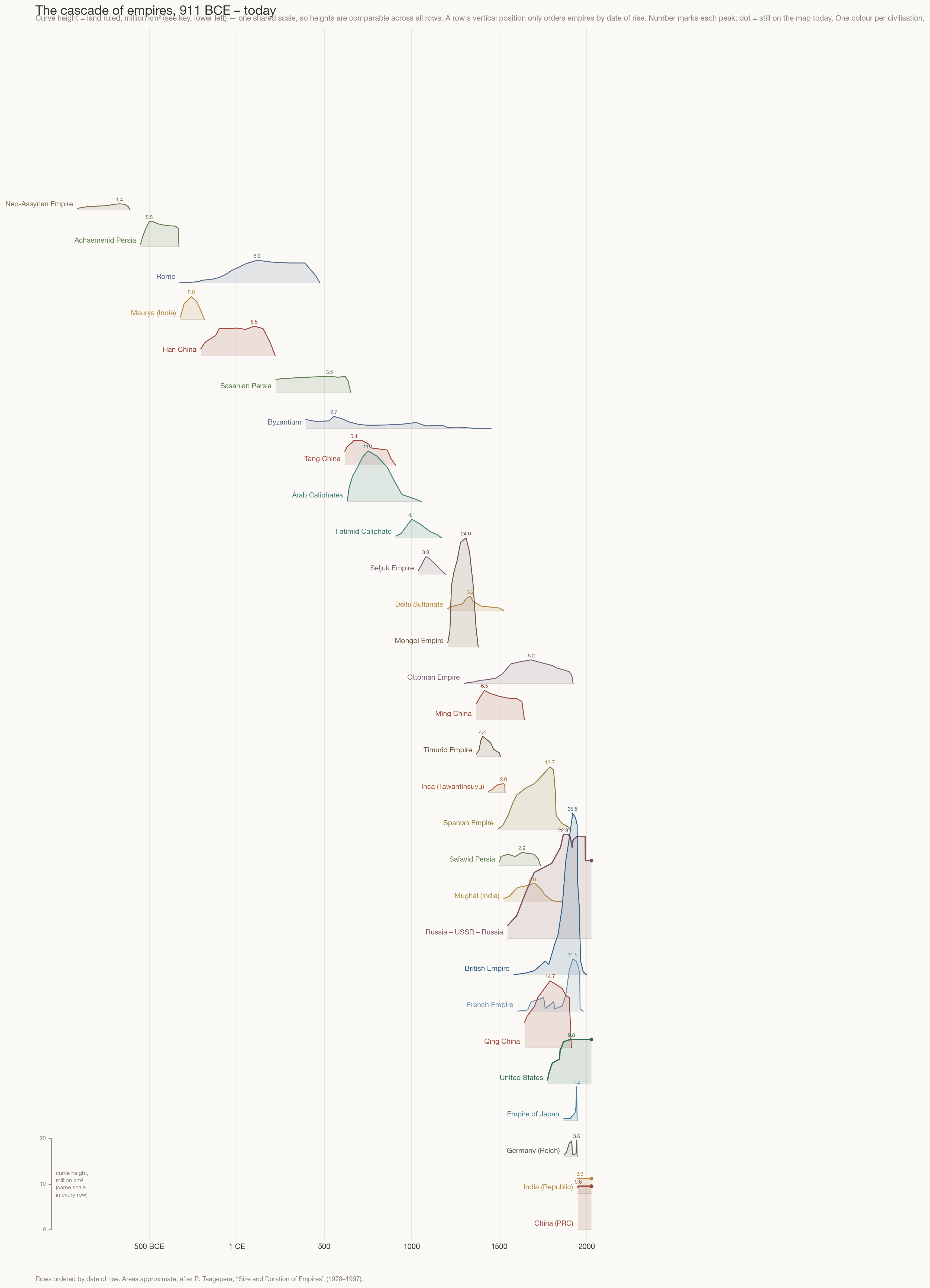
I.The cascade
Twenty-nine polities — empires, and the modern states that continue them — ordered top-to-bottom by the date they began to rise.
Time runs left to right; the height of each curve is the land it ruled,
on one common scale. Reading down any vertical line shows you everything
that was rising, peaking, or dying at the same moment. One caution on the
y-axis: a row’s vertical position carries no quantity — the offsets only keep
empires apart. Height above each row’s thin baseline is the measure, calibrated by
the key at the lower left.
To be precise about what is plotted — because this figure involves no model,
only bookkeeping — the curve drawn for the i-th row is
where is the empire’s territorial
extent and is a constant shelf that
spaces row i above its neighbours — pure separation, carrying no quantity.
(How to read the indices: i = 1…n counts the n = 29 rows from
the top of the chart, so each quantity subscripted i belongs to one empire;
Δ is the fixed gap between baselines; t is always the calendar year.)
The extent itself is a straight-line
interpolation1 between dated atlas estimates
, where
j counts an empire’s waypoints in time order:
No smoothing, no fitting, no inferred values: between waypoints the chart admits
it is guessing linearly, and the waypoints themselves are Taagepera’s estimates.
The same
drives the hover tooltips below.
Hover a curve to isolate one empire · move along the timeline to see who shared the world in any year
Figure 1. Territorial extent of major empires, 911 BCE–2026 CE,
million km² on a single shared scale. Number marks each peak; a dot means the state still
exists on today’s map. Colour groups civilisations — every brick-red curve is China. Row offsets are separation only; curve height above each baseline is the data (height key, lower left).
Areas approximate, after R. Taagepera, “Size and Duration of Empires” (1978–1997).
Three things jump out. First, scale escalates: antiquity’s
superpowers — Persia, Rome, Han China — ruled about 5–6 million km²; the Arab
caliphates doubled that; the Mongols doubled it again; Britain peaked at 35.5,
seven Romes. Each jump rode a technology of control: cavalry and roads, then the
horse-relay steppe, then the ocean-going ship and the telegraph.
Second, empires are never alone — Rome shared its whole life with
Han China and Parthia/Persia; the parallel rise of the gunpowder empires
(Ottoman, Mughal, Russian, Spanish) after 1500 is almost simultaneous — and the
Inca built the Americas’ largest empire in the very decades Spain’s caravels set
out to end it.
Third, civilisations pulse: the brick-red curve dies and returns
four times — Han, Tang, Ming, Qing — and is back on the map today as the PRC,
alongside republican India; Persia’s green line resurfaces twice (Sasanian,
Safavid); and the Islamic world fields a nearly unbroken relay from 632 to 1922 —
Caliphates, then Fatimids and Seljuks, then Delhi, the Timurids, and finally the
Ottomans and Mughals side by side. China is not one empire; it is a rhythm — and
it is not the only one.
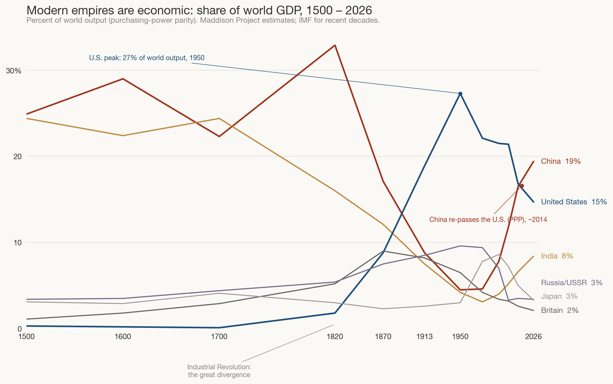
II.Power changes its unit
After 1945 almost nobody’s power grows by annexing land — the American
“empire” holds 9.8 million km² and has barely moved in a century, which is why
its curve in Figure 1 is a flat green shelf. Modern dominance is economic,
so the modern chart must change its unit: percent of everything the world produces.
Note the deliberate discontinuity: Figure 1 measures land and only
land, on one scale, for everyone — apples to apples within the figure. This figure
abandons that unit entirely rather than blend two incommensurable ones. What it
plots is a share,
where is economy e’s gross
product at purchasing-power parity2.
The values are Maddison Project reconstructions
(IMF for recent decades) joined by straight lines between benchmark years — again
data plotted directly, with no model in between. Because it is a share, the curves
answer “compared to what?” by construction: everything sums across the whole world
to 100.
Figure 2. Share of world GDP at purchasing-power parity, 1500–2026.
Maddison Project estimates, IMF for recent decades. Before the Industrial Revolution
the world economy simply was China and India; Britain peaked near 9% with the
world’s largest territorial empire; the United States peaked at 27% in 1950.
This chart quietly reframes the present. For eighteen of the last twenty
centuries, China and India together were roughly half the world economy; the
European and American centuries are the anomaly, opened by the Industrial
Revolution around 1820. On this metric the United States is not young and
ascending — it peaked in 1950, when a war-wrecked world made it half of all
industrial output, and has glided down to ~15% as Asia rebuilt. China’s curve is
best read not as a rise but as a reversion to its millennial mean.
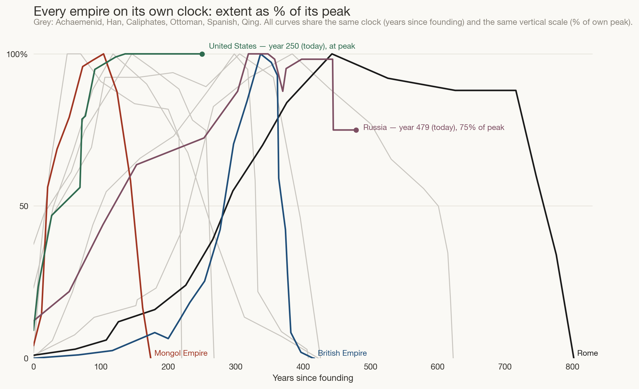
III.Every empire on its own clock
To compare the shapes of imperial lives — your “parallelness” question —
strip away both calendars and sizes: start every empire at year zero and scale each
to its own peak3. This is the only figure that transforms the data, and the whole
transformation is two rescalings of Figure 1’s
:
where is each empire’s founding
year. Time becomes age, size becomes percent of own peak — so every
curve starts at the origin and touches 100 exactly once, and only the shapes
remain.
Figure 3. Territorial extent as a percentage of each empire’s own peak,
against years since founding. Highlighted: Rome, the Mongols, Britain, Russia, the United
States; grey: Achaemenid, Han, Caliphates, Ottoman, Spanish, Qing.
There is no single life-cycle, but there are families. Explosive–brief:
the Mongols hit full size in a single lifetime and were gone within two centuries.
Slow–long: Rome took four centuries to peak and three more to die;
the Ottomans stretched the same arc over six. And the falls are getting faster:
Rome’s decline took ~300 years, Spain’s ~80, Britain went from its largest extent
(1920) to dissolution in about 40 — one human adulthood. The two dots mark
the present: Russia at year 479, still holding 75% of its 1895 peak — old, shrunken,
but the largest country on earth; the United States at year 250, never having
contracted at all on this measure.
IV.Claims, carefully labelled as claims
The charts above are data (approximate, but sourced). What follows is interpretation.
Where is America on its curve? It depends which curve you mean — and that
ambiguity is the honest answer. Territorially (Fig. 1) it is a young, stable,
never-contracted state, 250 years into a life that on historical clocks could run
centuries more. Economically (Fig. 2) it is 75 years past peak relative share,
on Britain’s glide path but much shallower — still ~15% of world output with
unmatched military reach, alliance networks, and the reserve currency. The most
defensible reading: past peak dominance, nowhere near collapse.
Modern empire is a network, not a territory. America’s real footprint is
its alliance system, the dollar, and its technology platforms; none of it shows up
in km². If those are the new land, the metric to watch this century is compute,
capital, and standards — not borders. A future version of Figure 2 may need yet
another unit, exactly as Figure 2 had to abandon Figure 1’s. (The sequel
post, A Common Currency for Power, takes up
exactly this: one index that can rank Rome, the Mongols, Britain, and America.)
China is reverting, not erupting. Its share of world output is returning
to the level it held for most of recorded history. The genuinely new element is not
China’s size but the speed of the round trip — a collapse and recovery inside
two centuries that Figure 2 shows as a V.
The cycles are compressing. Peak-to-dissolution took Rome ~300 years,
Spain ~80, Britain ~40. If the pattern holds, technology doesn’t exempt a hegemon
from the cycle; it shortens the back half. That is the strongest argument that
America’s remaining time at the top should be measured in decades, not centuries —
and the strongest caution against assuming the 21st century ends the way it began.
Multipolarity is the historical norm. Figure 1 shows that a world
with several simultaneous great powers (1600: Ottomans, Mughals, Ming→Qing, Spain,
Russia) is typical, and brief unipolar moments (Mongols in the 1270s, the U.S. in
the 1990s) are the exception. The present drift back to several centres of power is
a return to baseline, not a breakdown.
V.Method & honest caveats
Territorial extents are approximations after Rein Taagepera’s surveys
(“Size and Duration of Empires,” 1978–1997), interpolated between dated estimates;
values are uncertain by ±20% and worse for ancient states. GDP shares are Maddison
Project reconstructions (heroic for 1500–1820) spliced with IMF PPP data. “One empire”
is itself a judgment call — Rome/Byzantium and Tsarist Russia/USSR/Russia are each shown
as continuities, China as four separate dynasties; reasonable people draw these lines
differently. Bronze-Age empires (Egypt’s New Kingdom, Akkad, the Hittites) are left of the
chart’s edge on purpose: including them would stretch the axis by another
millennium for polities under ~1.5 million km²; Neo-Assyria, which bridges to
Persia, marks the deep end instead. In the Americas the Inca appear; the Aztec
confederation (~0.2 million km²) is too small to register at this scale, and vast
modern federations (Brazil, Canada, Australia) are single states, not empires. Land and GDP both understate nomadic, naval,
and network power. Treat every
curve as a sketch of magnitude and timing, not a measurement.